Redesigning AI Model Discovery in Microsoft Foundry.
Improving how developers explore, compare, and choose AI models through better visibility, clarity, and decision support.
Choosing the right AI model is a high-stakes decision for developers, but the tools meant to support that process often fall short.
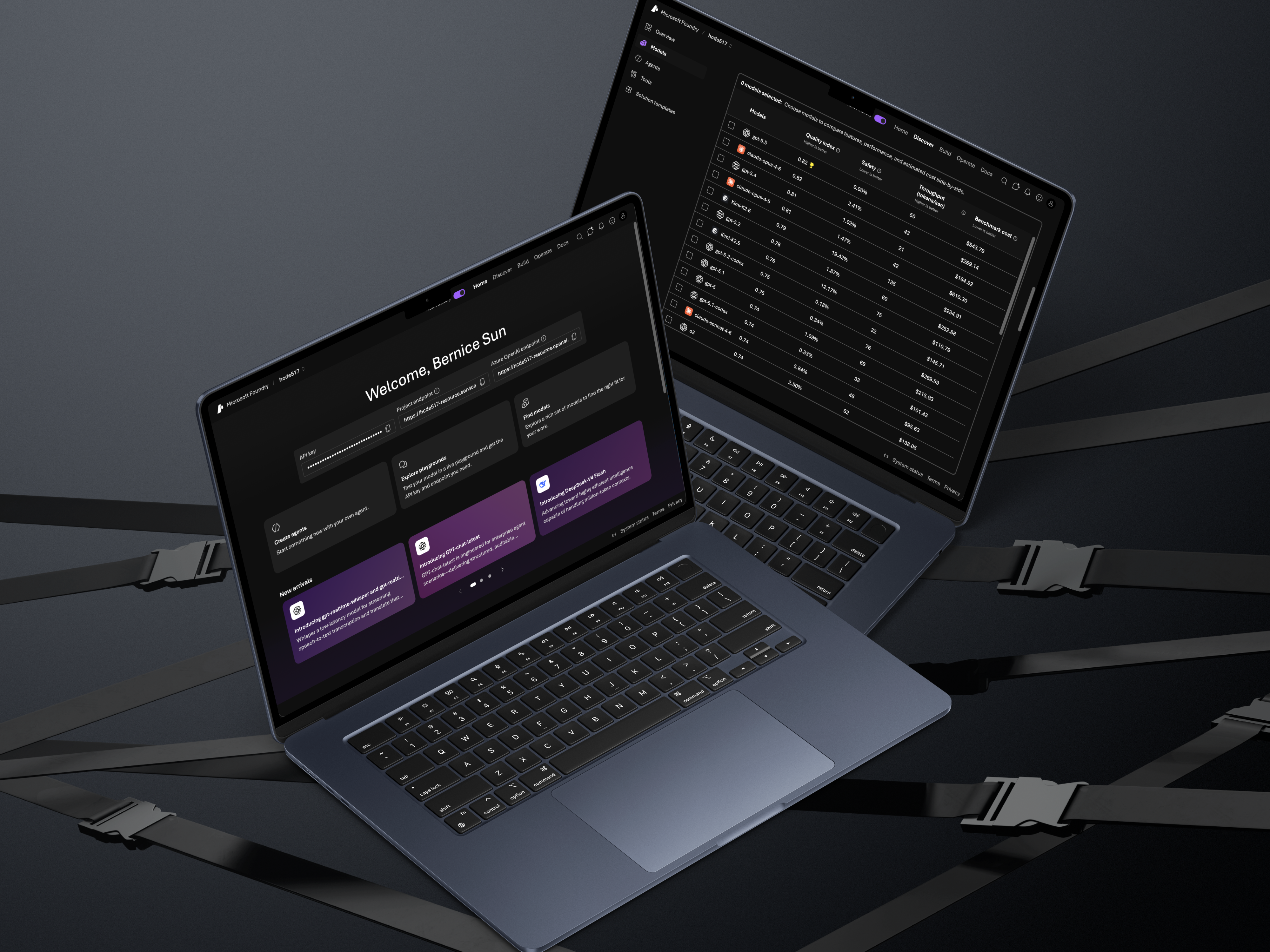
In collaboration with Microsoft's Core AI team, I conducted a usability study on Microsoft Foundry — an AI development platform — to understand how developers discover and evaluate models. Although Foundry introduced a redesigned interface in late 2025, our goal was to evaluate whether it actually improved the decision-making experience.
Through moderated usability testing and synthesis, I identified key friction points and translated them into actionable design recommendations that improve discoverability, clarity, and trust in AI workflows.
Problem
Developers rely on Foundry to explore and compare AI models, but the decision-making process is complex, the interface contains dense technical information, and critical tools exist but are hard to discover or interpret.
Key Question
How might we improve the experience of discovering, comparing, and selecting AI models in Foundry?
Defining the Scope
This study focused on how developers move through the model selection journey — where they start, how they compare options, how they interpret technical data, and what influences their final decision.
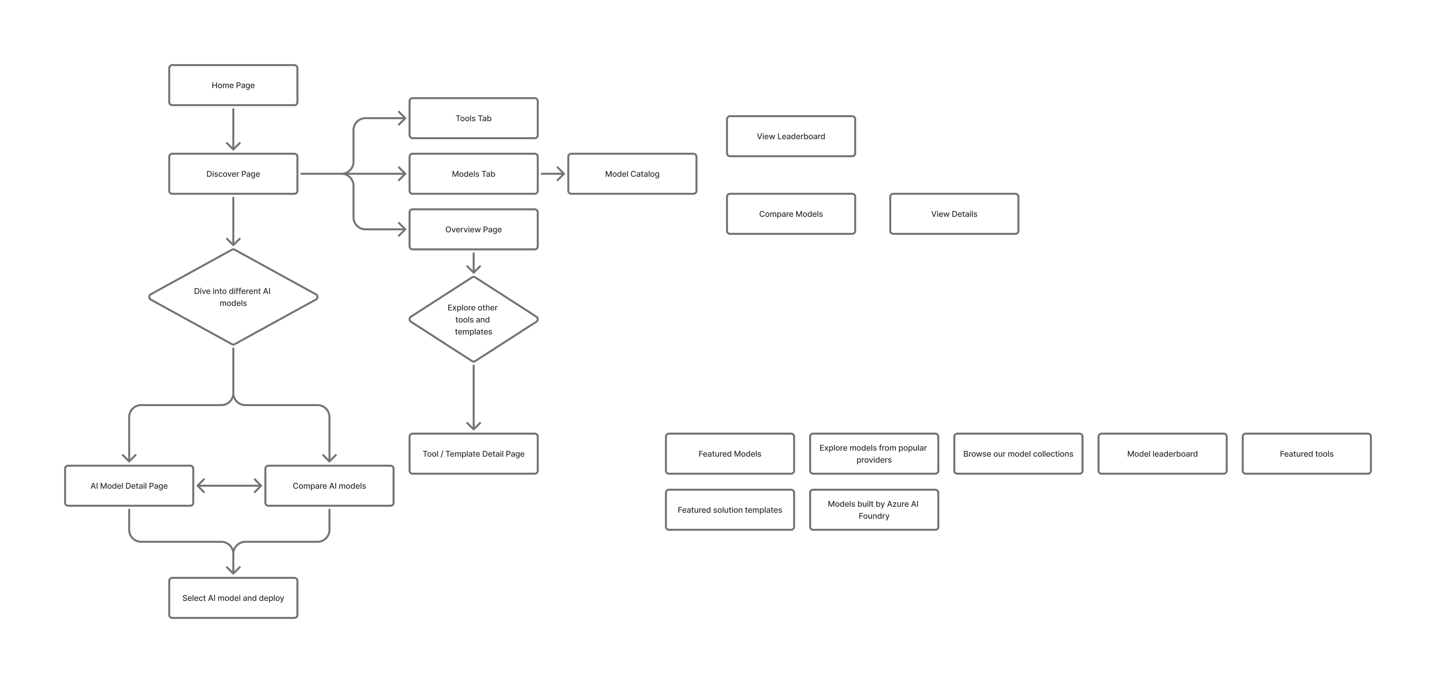
I structured the research around four key areas:
- Navigation — Can users find where to start?
- Discovery — How do they explore models?
- Comparison — How do they evaluate tradeoffs?
- Understanding — Do they trust the information provided?

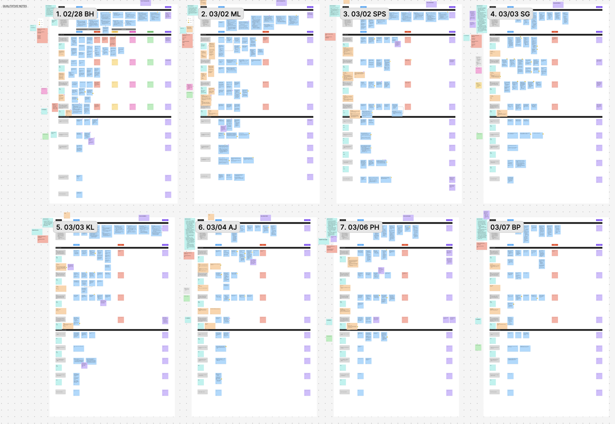
Remote moderated usability testing with 8 developers experienced in AI tools.
Participants
- 4 students + 4 software engineers
- All had ≥1 year experience with AI tools
- Most actively building or experimenting with LLMs
Method
Each 60-minute session included a pre-interview to understand workflows, 4 scenario-based tasks, a think-aloud protocol, and a post-test survey.
Core Scenario
Participants acted as developers building a chatbot and were asked to find a relevant AI model, compare models, evaluate tradeoffs, and decide which to use.
The biggest barrier wasn't functionality — it was visibility and clarity.
Foundry had powerful features, but users either didn't notice them or didn't understand how to use them.
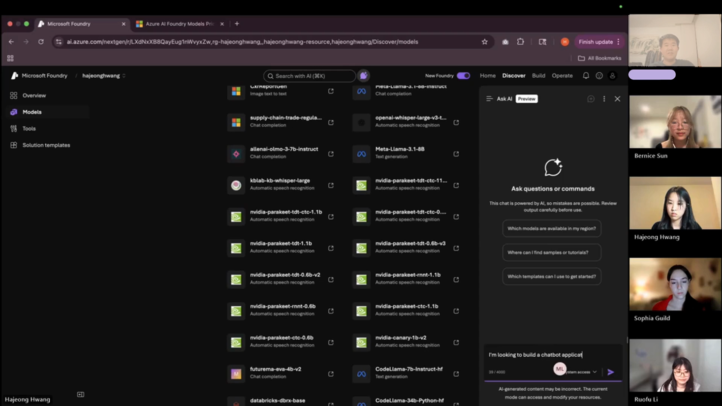
Hidden AI Assistance = Missed Opportunity
- 4/8 users didn't use AI search
- Only 1/8 clicked "Ask AI"
- Many said they wished it existed
Insight
Mismatch between expectation (AI help) and interface signaling.
Design Direction
Surface AI as a primary, visible assistant.
"AI Search" Didn't Feel Like AI
- Users typed keywords instead of prompts
- Received vague, unhelpful results
Insight
The UI failed to communicate a conversational mental model.
Design Direction
Separate chat-based AI from traditional search. Use familiar chatbot patterns.
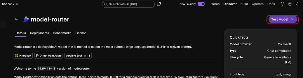
Powerful Tools Were Hard to Find
- Some found Compare Models instantly
- Others took 3+ minutes
- One never found it at all
Insight
A discoverability problem, not a usability one — once found, satisfaction was high.
Design Direction
Surface comparison across all key touchpoints.
Data Without Context Breaks Trust
- 6/8 wanted explanations for metrics
- Missing data caused confusion
- Reliability was questioned
Insight
Information without context reduces trust.
Design Direction
Add tooltips, definitions, and explanations throughout.
Decision-Making Happened in One Place
- ~7 minutes comparing
- ~3 minutes on model detail pages
- Some skipped detail pages entirely
Insight
Users favor scannable, visual decision tools over deep-dive pages.
Design Direction
Bring comparison-style visuals into model detail pages.
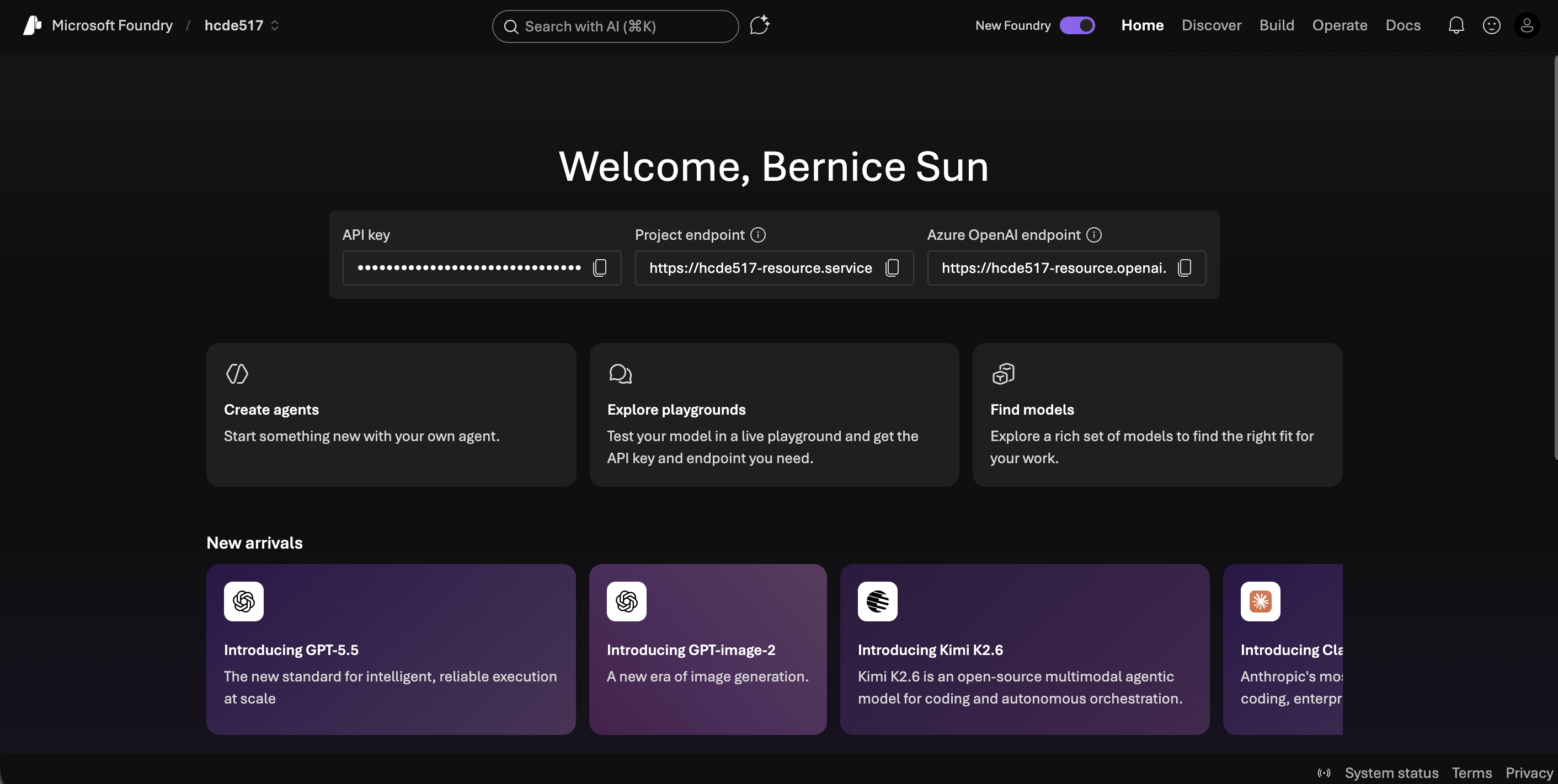
Users Defaulted Outside the Platform
- Most said they'd leave Foundry to test models
- Few noticed the built-in playground
Insight
The end-to-end value of Foundry is unclear.
Design Direction
Emphasize testing and deployment workflows within the platform.
A clearer, more guided AI model selection experience — built for decision-making, not browsing.
01 — Make AI Assistance Visible
Floating chatbot entry point with strong visual hierarchy. Separate keyword search from conversational AI with distinct, recognizable interfaces.
AI Search
Before
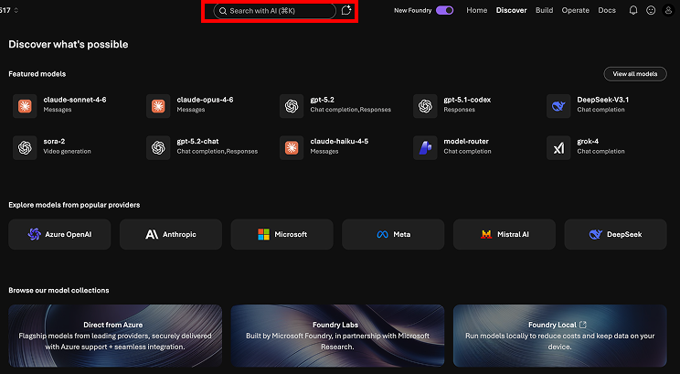
After
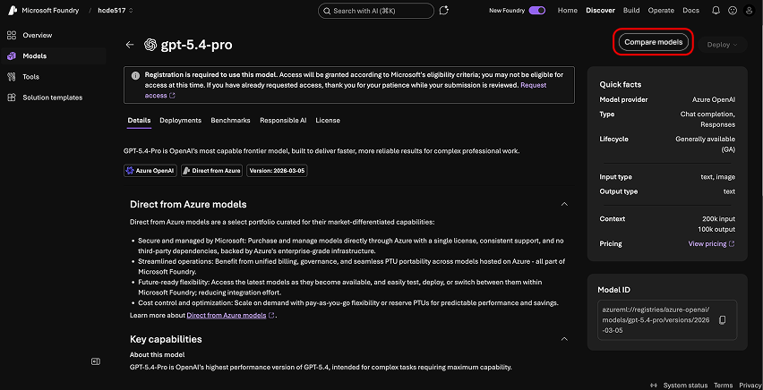
03 — Increase Feature Discoverability
Surface "Compare Models" CTA consistently across model pages and catalog views so users encounter it naturally in their flow.
Compare Models
Before
After
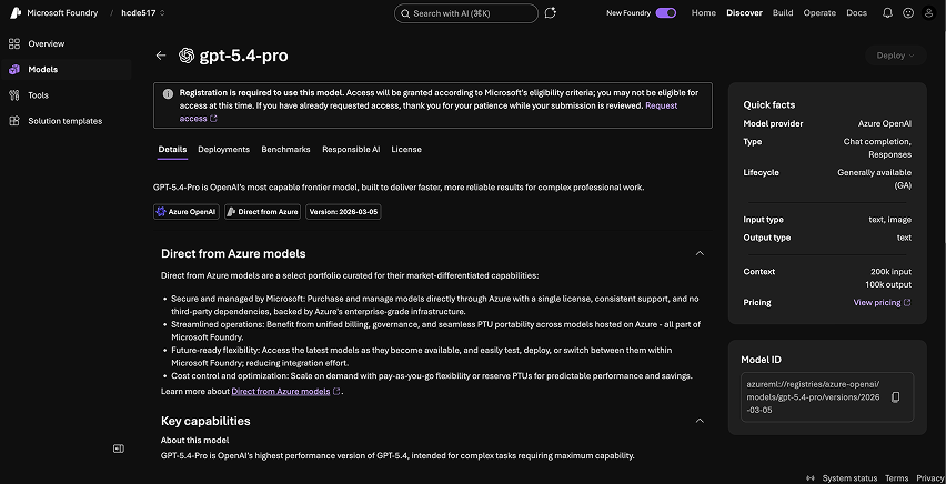
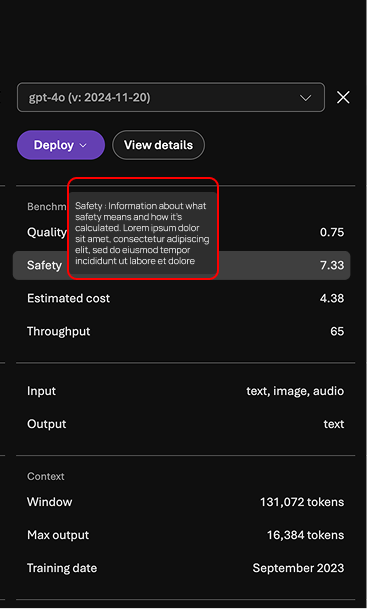
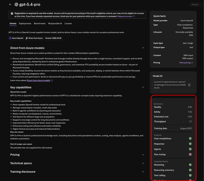
04 — Improve Data Transparency
Add tooltips for metrics, explanations for missing data, and clearer definitions throughout — reducing confusion and building trust.
Benchmarks
Before
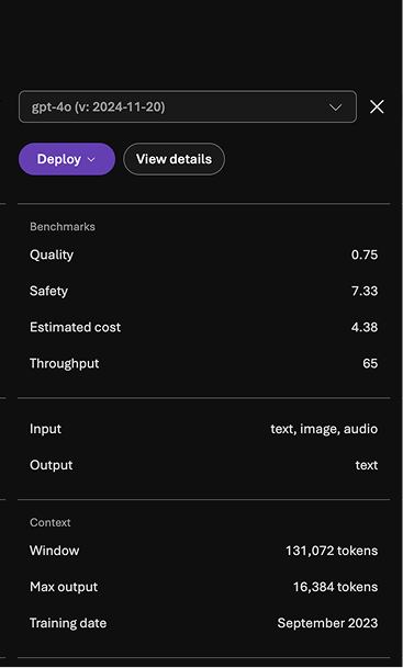
After
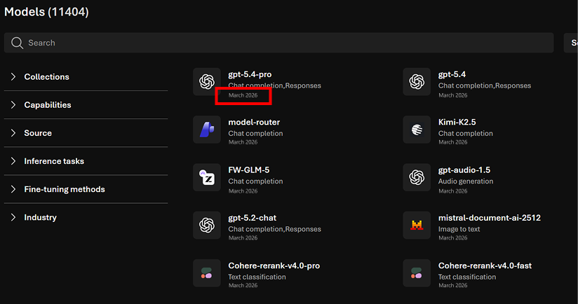
Catalog
Before
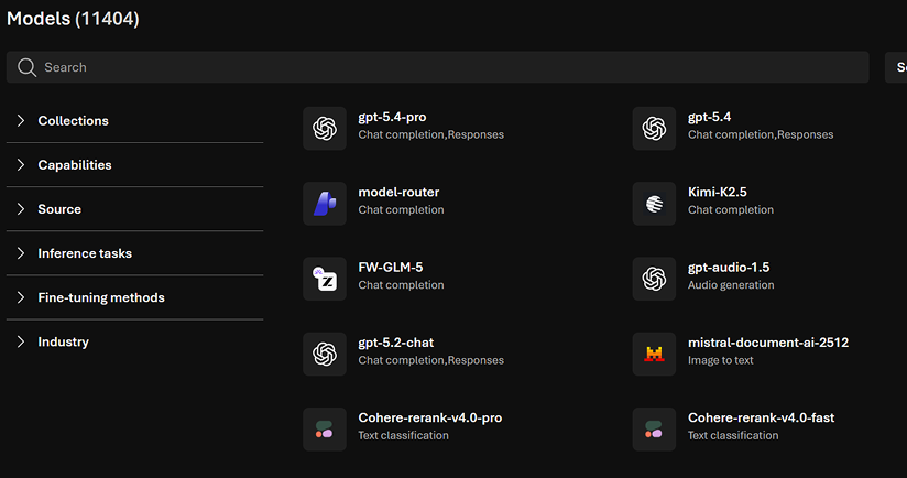
After
05 — Unify Comparison + Detail Views
Embed comparison visuals directly into model detail pages to reduce context switching and keep users in their decision-making flow.
Model Specs
Before
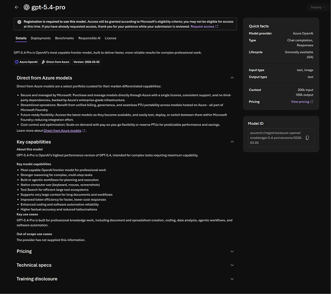
After
06 — Reinforce End-to-End Workflow
Clarify deploy and testing flows, and highlight playground capabilities so users see Foundry as a complete platform — not just a catalog.
Deploy Flow
Before
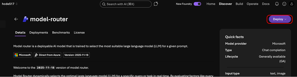
After
Our findings and recommendations were integrated by the Microsoft Core AI team.
- Identified critical usability gaps in a production AI tool
- Provided actionable recommendations to Microsoft's Core AI team
- Highlighted the importance of visibility and trust in AI UX
Powerful features are useless if users can't find or understand them.
This project reshaped how I approach UX in AI systems. The most valuable insights came from hesitation, not success — watching where users paused or looked confused revealed far more than task completion rates alone.
AI products require designing for mental models, not just functionality. Working across research and design, I translated user behavior into product decisions — strengthening my ability to bridge insight and execution in complex systems like Microsoft Foundry.
Next project
TIFIN Website Redesign